Drawing Sell Lines
So you have given drawing buy lines a go, now is the time to draw sell lines!
What to look for:
We already know it’s the peaks of up moves that we need to join in order to draw a sell line. However! there is other ways of drawing up a sell line.
Some of the best sell lines are drawn by connecting “most high points” – so if you notice a few candles have hit the same price and retracted – it could be an area of resistance and enough to warrant a sell line to be inserted.
⇑ ⇑ ⇑ ⇑ Drawing Sell Lines
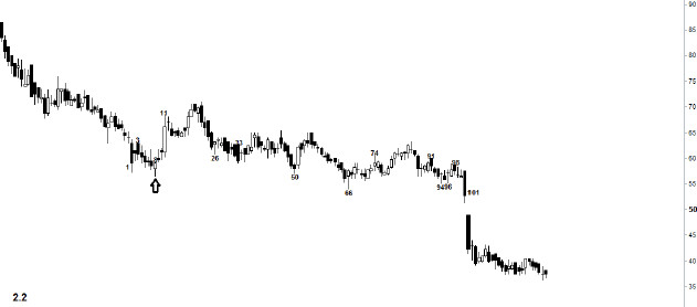
The chart below is sell line-less and needs some sell lines to be placed upon it!
This chart is for a diamond mining company in Africa. It’s chart isn’t the easiest to detect the high points you need to connect to make a sell line as it has some wacky and wild wicks!
Have no fear! We have inserted some arrows to draw your attention to what you need to be looking for. The upper-most sell line has the two white arrows to help you.
With the other sell line we have only given you the single black arrow to show you one high to use in drawing your line.
Give it a go and remember – you need to draw a line to connect as many highs (and lows from above) as you can. (It is okay to have the spikes sometimes go through your line on a chart like this, just try to connect most of the spikes/candle bodies).
Dam you Sell line! You used to be such a sweet little buy line but YOU HAVE CHANGED!
When the market gets below a buy line it becomes a sell line. If it then gets back above the sell line then it becomes a buy line again!
Why does this occur?
You will learn more about the psychology of buy lines in the reversal pattern tutorials however what we would say is if prices drop below a buy line – all those who bought in the support area now realise they made a mistake. Should the price rally back up to just underneath what was the buy line then these participants will be able to sell their shares near to where they bought them.
The reason why a buy line is a buy line is because it is a price dominated by buying activity, providing ‘support’ to the price.
If the price moves below the line then it often becomes an area of selling activity should the price get near the sell line. Traders opinion of the line changes and they use it as a selling target.
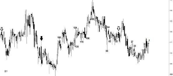
Your final task is going to test everything that you have learned so far. There is two horizontal buy lines and two horizontal sell lines that can be placed onto this chart which would help you determine when to buy and when to sell the shares.
Remember – if the current price is above a line then it becomes a buy line. If the current price is below a line then it is a sell line. (This will help you locate the lines on the chart!).
By now you should know whether you are looking to connect wicks/ candle bodies or both when drawing a trend line.
Remember, if you can connect a few high points and low points of higher candles then chances are you have a good solid trend line.
This may take some practice to get used to so don’t worry too much if you find it a little too challenging at first.