


Technical Analysis Indicators
The smartest thing you can do when it comes to selecting a technical analysis indicator, is to select them all. The more the better. I find it easier to trade the stock when I can’t actually see the stock. Ignore the stock, trust your indicators and you will be filthy rich. Class dismissed.
I could easily dedicate and entire website to TA indicators- but you and I would become poor. There are tons of ‘em. A few examples are STO (Stochastics), MA (Moving Averages), MACD (Moving Average Crossover Divergence), ROC (Rate Of Change), BALT (Buy a Lottery Ticket), and WWJD (What Would Jesus Do?).
I probably don’t understand 95% of the new and complex indicators out there… but I honestly don’t care. I use only a few time-tested, bank account approved, incredibly powerful indicators. And they work.
Remember. No matter what an indicator claims to do, it is still a calculation of price and volume. Therefore, all indicators are lagging indicators and cannot predict the future. But when used in conjunction with patterns, candles, and other key strategies, we can get pretty damn close.
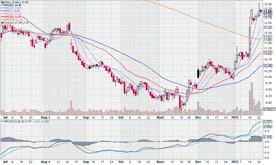
Let’s start with Moving Averages. Moving Averages (MA’s) are a common indicator used to show the average price of a stock over a certain period of time. We use moving averages for a number of reasons, like identifying supports and resistances. However, there are many other ways to use them.
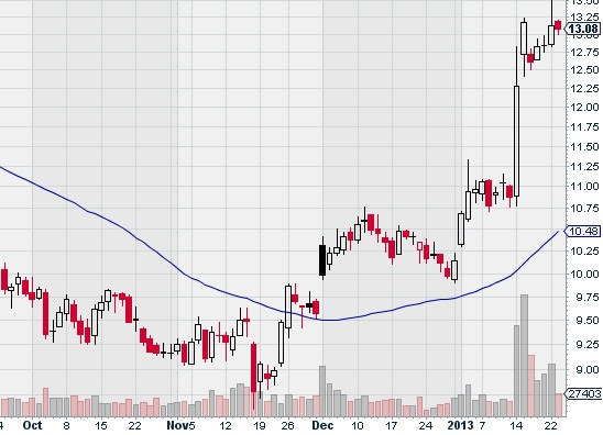
Here is a basic chart with a 50-day moving average which is represented by the blue line. The higher the time period, the smoother the line will be. In this example, one might suggest that the stock attempted to break through the 50 day moving average (around Nov 15th) but failed. This was a resistance. Once it broke through (Nov 26th) the 50 day became a support. We see that it bounced off the 50 day right before December and then again at the very end of December.
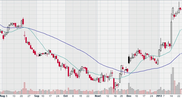
Here I have added a 15 day moving average. It is not as smooth at the 50-day and it ‘follows’ the stock more closely. See how the 2 moving averages touch and crossover each other? Do you see a correlation with the timing of the MA-touch and the overall movement of the stock? We can clearly see that the stock’s major direction changes in August and December line up pretty well with the crossovers. For this example, I did not go searching for a special chart, this is the first ticker I grabbed (DELL).
There are hordes of people who study this simple correlation. There are many discussions around what happens when the 50 crosses above the 15, or when the 20 crosses below the 200, or when the 5 crosses above the 30, etc etc. I personally like to use a 5, 10, 15, 30, 50, and 200. It looks like a ribbon. When the ribbon ‘crunches together’ I perk up:
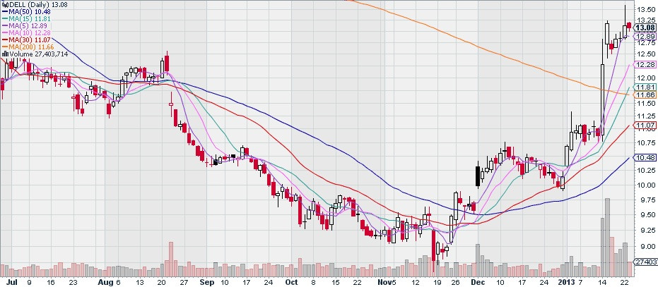
You can see the ribbon ‘tighten’ right before a swing.
Now although I like to use Moving Averages in this way, it is not my primary use. Whenever I buy into a stock, and it is moving upward, I like to use my 5, 10, and 15 day as a guide for when to sell. As a stock makes a solid run upward, it will be trading above the 5 day, 10 day, 15 day, and sometimes my 30. I use these as my ‘nets’ and will sell the stock if it falls below my net.
I will decide which net to use based on how conservative I want to be and how the stock has behaved in the past. So if a stock historically shows me that it does well until it falls below the 15 day, then if I buy in, I use the 15 day as my net. If it feels very ‘fragile’ and likes to tank at the first sign of trouble, I will use the 5.
MACD (Moving Average Crossover Divergence)
MACD is a pretty common indicator and is a variation of Moving Averages. Standard MACD uses 2 moving averages and a zero line. It does not overlay the chart but rather hangs out below the chart. See below:
You can see the 2 bluish colored Moving Averages as well as a ‘zero’ line that runs horizontally across the middle. The zero mark is shown on the right hand side (Y axis). The idea is pretty simple. When the MACD lines cross over the zero line, the stock is changing direction.
We see that theory failed in mid-August, but it succeeded in late November. MACD has made me more money than any other indicator. But I never use it alone. If you do, you can lose your ass (see how this one fooled us in mid-August?) But if you know how to use it appropriately in conjunction with other trend lines and patterns, you can make a freakin’ fortune.
