


A Look At Bollinger Bands
Today’s post takes a look at another technical indicator that is used quite a bit by technical traders and chartists – Bollinger Bands. Developed by John Bollinger in the early 1980s, bollinger bands are a pair of trading bands that depict the upper and lower trading range of a particular security. The bands are used to measure the highness or lowness of a share’s current price relative to it’s previous trades. Bollinger Bands are calculated based on a standard deviation from a simple moving average, with an upper and lower bollinger band depicting how far from the selected simple moving average that the current share price is trading at. Most charting software allow you to display bollinger bands and set the standard deviation and moving average you want to work off with 2.0 standard deviations from the 20 day simple moving average a commonly used indicator by traders.
So Why Should We Use Bollinger Bands
Ok so lets move away from all the technical jargon as to what Bollinger Bands are and how they are calculated and look instead as to the practical reasons as to why we as traders should use them. The way I see bollinger bands is as a great way to highlight volatility. When the bands are tight together it means the stock is trading very close to the 20 day moving average. This means we have very little volatility or are in what is often referred to as a volatility squeeze. And the important thing about volatility squeezes is that they rarely last forever. Sooner or later Mr. Market makes it’s mind up and either the bulls beat up the bears or vice versa. When that happens we get some real movement in the share price, often referred to as a volatility expansion, and that’s what us traders like. So whenever I spot bollinger bands that are tight together that’s when I keep that stock on my radar and check it regularly over the coming days or weeks waiting to see if a breakout is going to come. When it does come that’s when I jump on board and either go long or short. It is also worth noting that in general the longer a share trades in a tight range or a period of low volatility then the more significant or violent the breakout tends to be when it eventually comes.
Helping to identify these breakouts are what bollinger bands are very useful for. As the bands are a measure of the average trading range, most of the time the share price will stay inside the upper and lower bands. Often you will notice that the price tends to tag either the upper or lower band for a while without breaking through it before reversing to tag the opposite band. These tag reversals in themselves can help highlight excellent short-term trading opportunities. But what is often more significant is when a breakout of either the upper or lower band happens. In these cases when a breakout of the bands occurs then in general this trend is usually maintained. And following on from that, when the share price moves from closing outside the bands to back inside them, then this usually signals a trend reversal.
Lets Take A Look At Some Examples
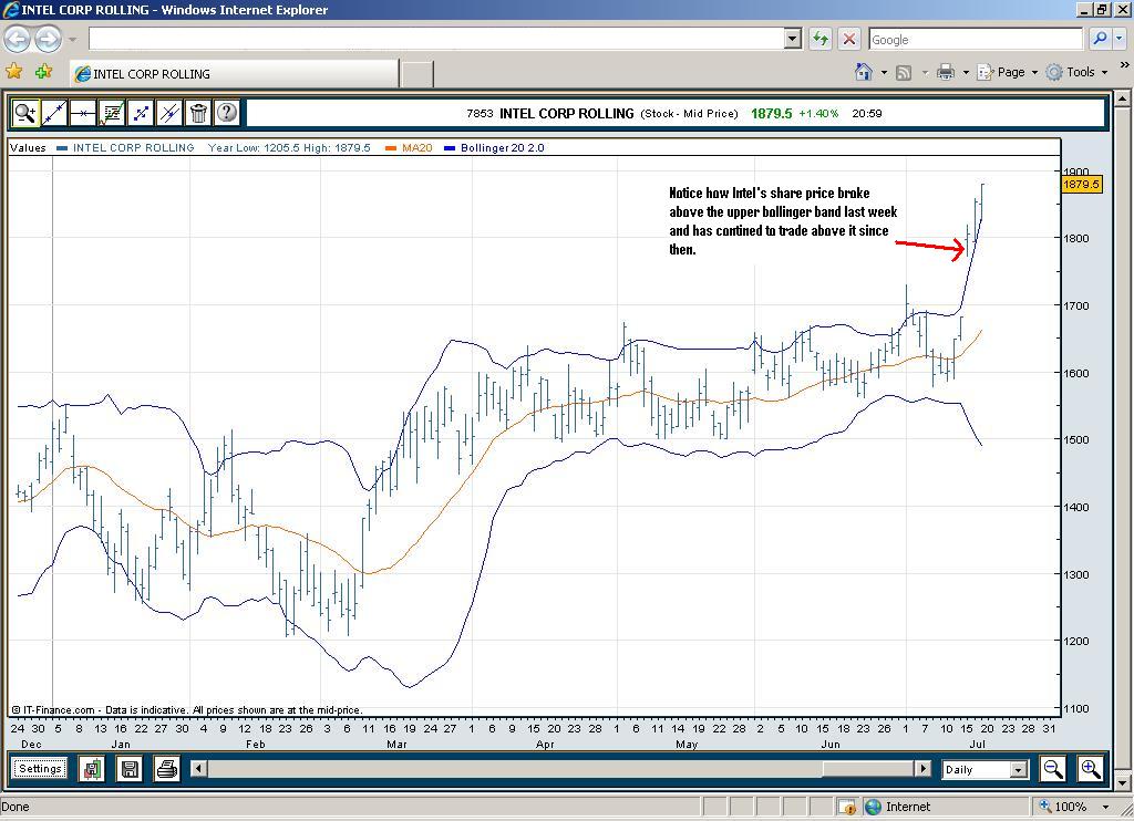
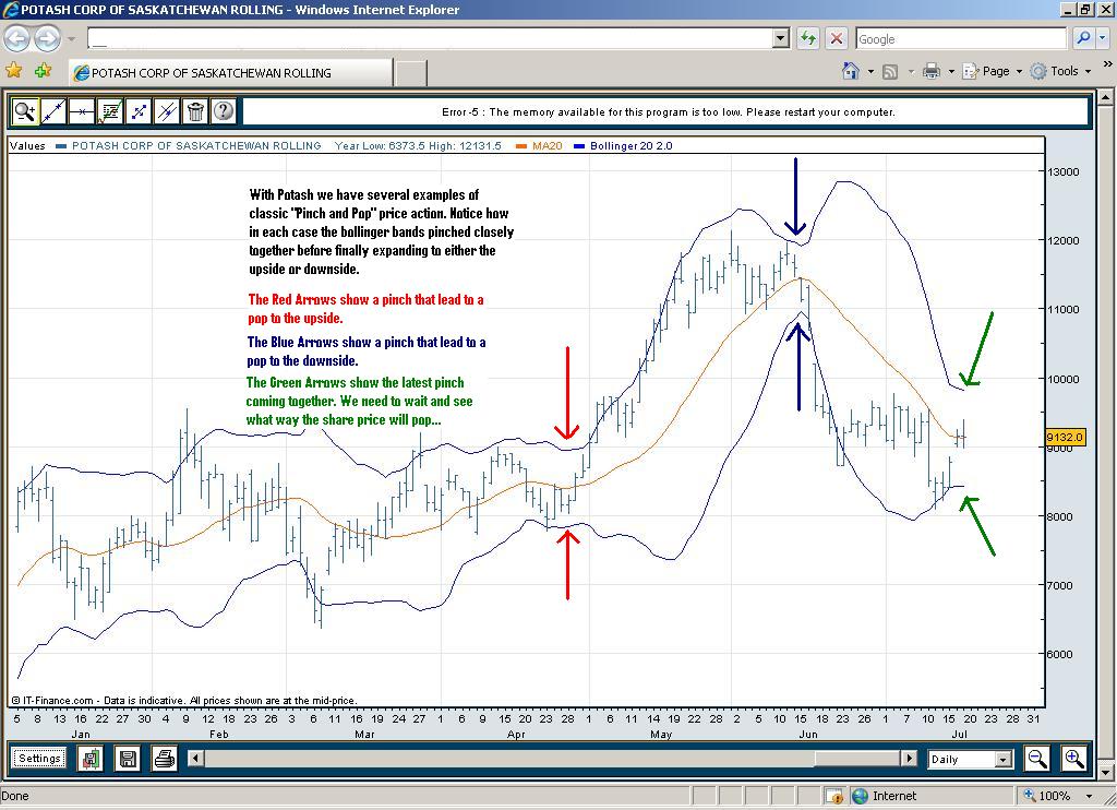
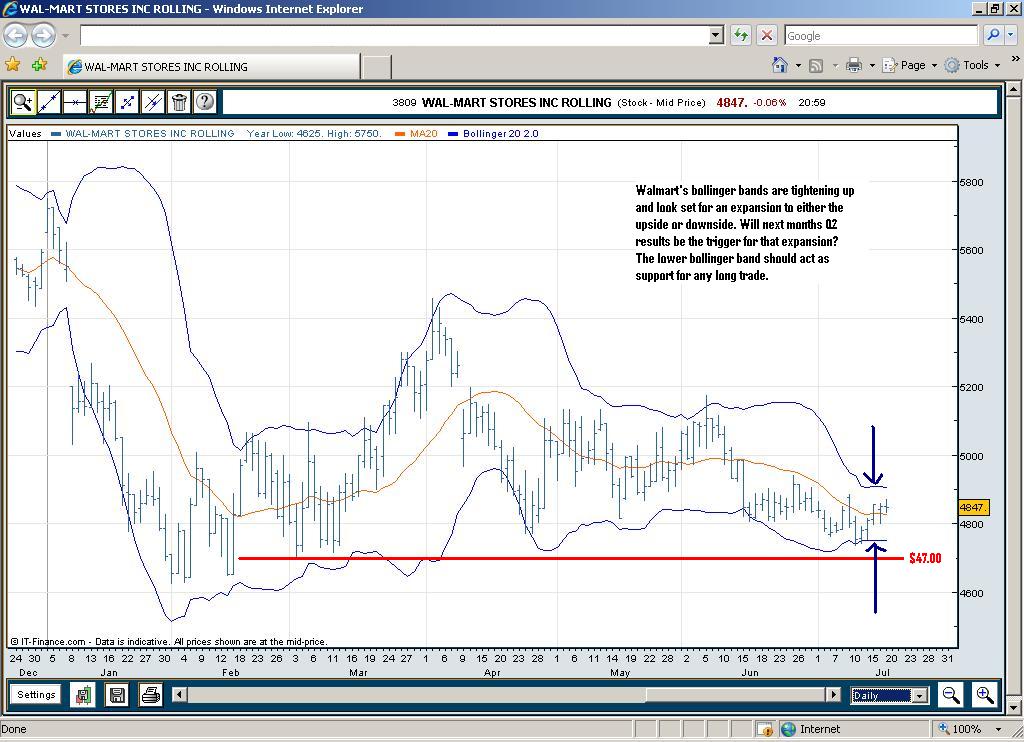
Probably the best way to get a feel for how Bollinger Bands work and how they might help you in your trading decisions is to look at a few examples. I have scanned a few charts looking for some examples which I think might be useful. The first two examples below (Intel and Sandisk) show the move after the volatility squeeze has taken place and the share price is now making a decisive break upwards, hugging the upper bollinger band. The second two examples (Potash and Walmart) show shares who are currently in the midst of a volatility squeeze and whose bollinger bands are now very close together. I’ve included these second two examples as possible charts for you to keep an eye on over the coming days / weeks to see if the bands start to widen as the share prices make a move higher or lower. As always click on each of the charts below twice to zoom in and see the larger version.
First up is Intel, after their excellent results last week which blew away the streets expectations the stock has jumped 11% since Wednesday. Notice how since mid-March the stock has been in a tight trading range between $15 and $17 and during this time the bollinger bands have remained very close together and the share price never really broke outside the lower or upper band all this time. But in the last few days we have had a volatility expansion to the upside with the share price now trading outside the upper bollinger band. As mentioned above, this is usually an indication that the current trend should continue.
The Sandisk chart provides us with an almost identical example. In this case notice how the share price for several months moved between tagging the upper band to reversing to tag the lower band but never breaking through either. That was until last week when the shares moved sharply higher with the stock trading above the upper bollinger band. This upward movement is in anticipation of Sandisk’s Q2 results which are due out Wednesday. This move higher was no doubt helped by the breakthrough significant resistance at $16.50.

In Potash we have a share which is now consolidating again after a rapid fall in mid June when it’s share price crashed from about $120 a share to around $85 a share in the space of a week. This fall saw a massive expansion in it’s bollinger bands but over the last couple of weeks the share price has leveled off again around the $90 mark and with that the bollinger bands have moved closer together once more. We should continue to watch these for signs of the next move either higher or lower.
And finally, Walmart, once again this chart shows us bollinger bands which are pinching together as the share price trades in a tight range between $48 and $49. After a pinch we usually get a pop, so I’ll certainly be watching this one for a breakout in one direction or the other. My guess is it could be to the upside. Q2 results are not due out until mid August but following on from some strong results from other retailers I think Walmart could follow suit. The good thing about a long trade here is that given the tight trading range recently a relatively tight stop can also be applied just above the $47 mark.
Some Final Thoughts On Bollinger Bands
As mentioned in the past there are lots of technical indicators out there, in the past we have looked at Volume and RSI and going forward I’ll continue to cover others from time to time. I think the important thing with all these is that we don’t get overly bogged down with them and don’t let any one indicator dictate our approach to trading. Instead we should be aware of the important ones, understand what they are telling us and feed that information into our decision making process. If you are considering a long or short trade, take 5 minutes to scan the various technical indicators that you consider important or have worked well for you in the past and see if they backup the trade you are looking at. But don’t spend too long scrutinising them because at the end of the day these technical indicators are just that, indicators.
And bollinger bands are no different. I have started to use them a bit more myself in recent times in helping me analyse shares which are in tight trading ranges or volatility squeezes and have found that sharply expanding bollinger bands can indeed be an excellent indicator of the direction a stock price is going to head. Sometimes it can feel as if the horse has already bolted and that there is no point opening a trade after an initial breakout in either direction has happened, but don’t let that deter you. As we have mentioned many times in the past, breakouts (particularly high volume breakouts) can go for much longer than anyone expects and as always, it’s best we trade with these breakouts than against them.
Until next time,
Happy Trading :-),
