


Japanese Candlesticks
The Japanese candlestick was invented in 1632 by … wait no … I don’t care. And neither should you. Lets look at what they mean and why the hell I claim them to be ‘better’ than other forms of charting.
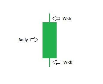 A typical candlestick is composed of a body and 2 wicks. Any part of the candle can be taken to the extreme. You can have a short body or large body, a short wick or long wick, or no body at all, or no wick at all. We will go through some very important variations later on.
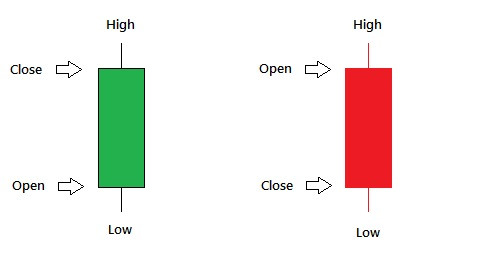
 The color of the candle is very important and you will notice that everyone uses a different color scheme. I recommend you pick one and stick to it. In this example, we have a green candle and a red candle. The green candle tells us the closing price was higher than the opening price. So it was a positive move upward. The opening price is indicated by the base of the body and the closing price is marked by the top of the body. The wicks represent our ‘extremes’. The low wick represents the lowest price the stock was traded at and the top wick represents the highest price the stock was traded at.
If you look at the red candle, just reverse everything. Since it is red, we immediately we know that this was a negative move downward. So the top of the body represents the open, the bottom of the body represents the close, and the wicks are our extremes. (see the figures above)
Remember- a candle can represent ANY unit of time. Although I will almost always be referring to a 1 day candle, many day traders will use other units of time. (5 minute, 15 minute, 1 hour, etc). So if we are looking at a 1 hour candle, the candle tells us the starting price, ending price, and the extreme highs and lows for that hour. After hour 1 of trading is done, the chart will start to draw hour 2 and so on…
Example time:
 This is what I call a hammer or a hangman. (I always call them hammers whether positive or negative). What can we learn from a hammer? We see that the stock opened and closed at roughly the same price, but before it closed it went to an extreme low and it fought its way back up. If we could plot every single trade that occurred ‘within’ this hammer, it would look something like this:
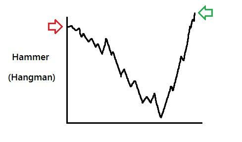 We see that it opened, fell down, fought its way back up, and closed just a hair above where it started. This would represent the green hammer.
By comparing the size of the wick with the size of the body, we are able to understand if there was a ‘struggle’. If this candle were plotted as a dot on a line graph, we would literally be missing out on tons of information. This struggle or indecision is exactly what we look for and can be much more pronounced when combined with other candles over several days of trading.
Let’s look at a hypothetical example of a hammer in action:
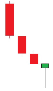 Here we see 3 red full body candles. Then we see a hammer. Suddenly we realize there has been some indecision, and although it may continue to fall, it could be our first clue that we might have found the bottom… and a swing is close by.
Let’s imagine something else:
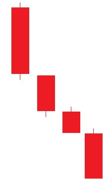 Here we see no hammer and thus no indication of a struggle. No indecision. No clues that a swing is coming.
Although these are very different charts, tell us very different things, and can lead to a very different trade… they would look basically the same on a line graph:
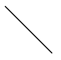 Pretty useless huh?
So there you have it. Basic candlesticks in action.
Time to dive into the most important candle types and patterns. Be sure to study this terminology as I use it often.
